
LEKA - IMPROVE INVITE ONLY
PROJECT INFO
Year
2023
Timeline
4 weeks
Role
Product Designer
Scope
Research → UX → UI → Prototype
INTRODUCTION
Leka entered its beta phase as an invite-only social app. The C-Team believed exclusivity would help control early growth and establish an atomic, high-quality user network. The strategy was simple:
Limited access → exclusivity → higher perceived value → stronger loyalty.
This model, proven by companies like Facebook and Google, leverages product scarcity to create demand. However, for exclusivity to work, users must clearly understand the product from the first moment they join — and this was where friction began to appear.
UNDERSTANDING THE PROBLEM
Through conversations with the product team, support staff, and one-on-ones with users, we identified a recurring onboarding issue: new users did not understand what Leka actually was.
Survey insights revealed:
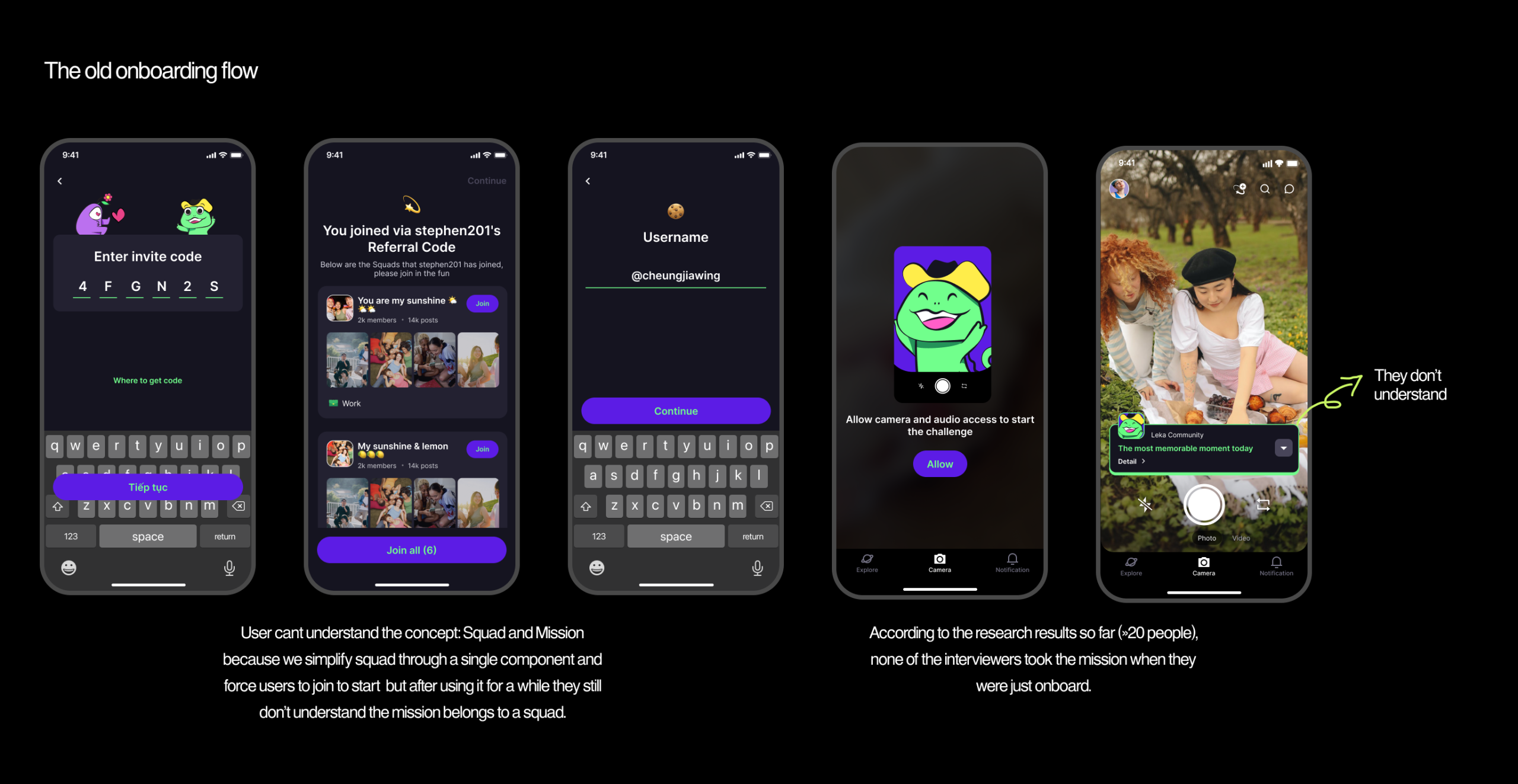
43/70 users struggled to understand core concepts: Mission and Squad — Leka’s main value propositions.
New members often got stuck on login instructions and invite-code steps.
Even colleagues who used the app internally could not clearly explain the product.
The unfamiliarity of Leka’s concept — a utopian, community-driven social structure — created immediate confusion. As a result:
❗Problem
Users accessed the app… but did not understand its purpose or how to start.
Why this hurts users
They didn't know what to do next, where to go, or what “Squad & Mission” meant.
Why this hurts the business
If users cannot grasp our USP from onboarding, they cannot engage, invite others, or unlock the core loop of Leka.
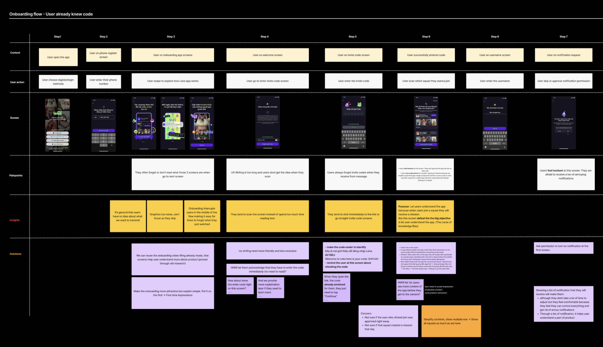
Together with our UX Researcher, we reviewed all onboarding screens in a FigJam workshop.
We mapped:
- Where confusion occurred
- Which instructions were ignored
- What could be simplified, removed, or redesigned
- Which parts of Leka’s existing content could be repurposed to reinforce understanding
Our goal was to build an onboarding flow that communicates Leka’s world — not just its UI.
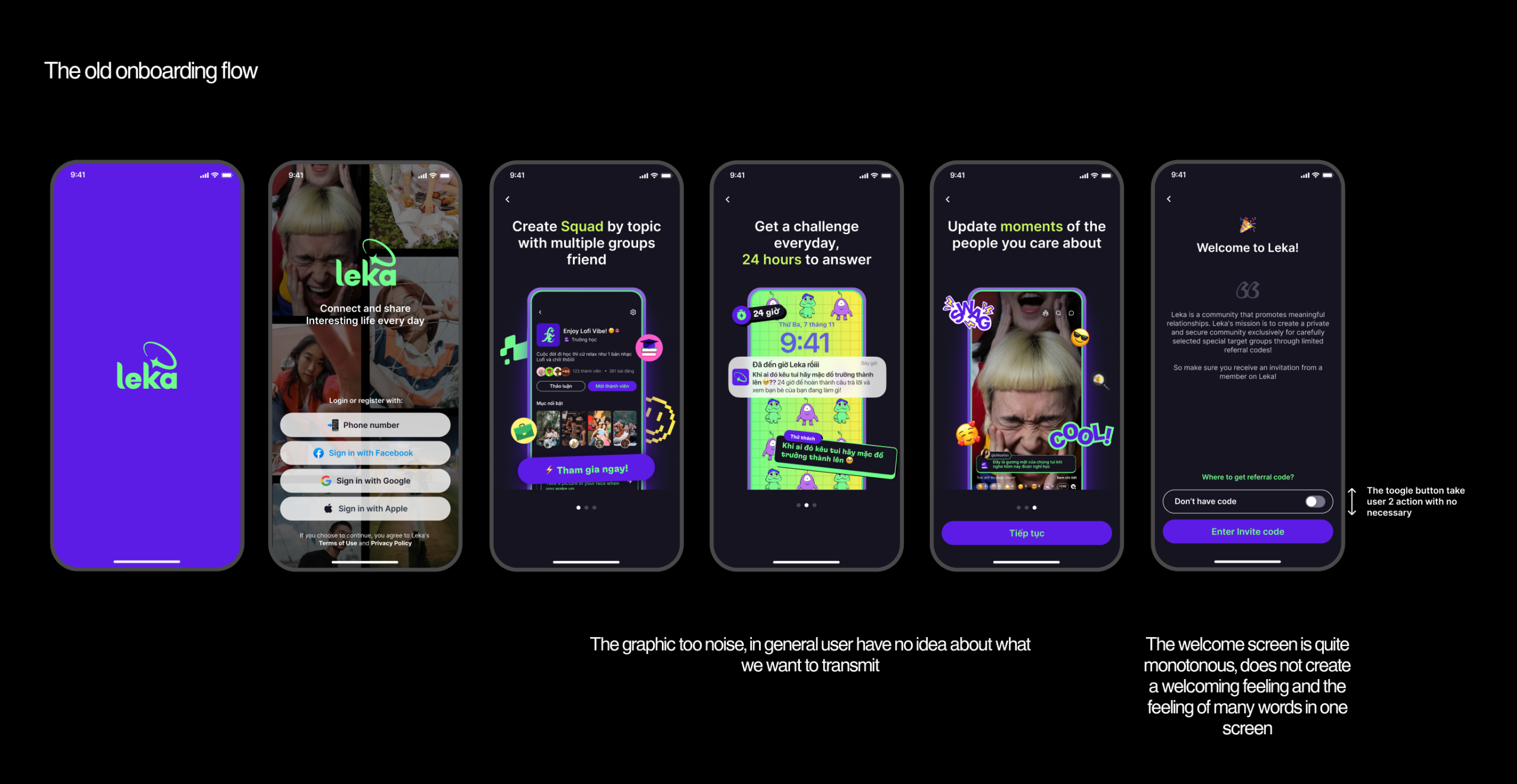
APPROACH
With a new type of social product, our challenge was twofold:
Business Need: Users must understand Leka’s concept immediately.
User Need: Onboarding should feel friendly, fun, and effortless — not serious or instructional.
OBJECTIVES
1. To improve the usability and heuristic of the current UI design
2. To improve the emotion of joining fun place
3. Add tutorials let user more understand about the concept app
4. Reducing the serious emotions of the app
SOLUTIONS
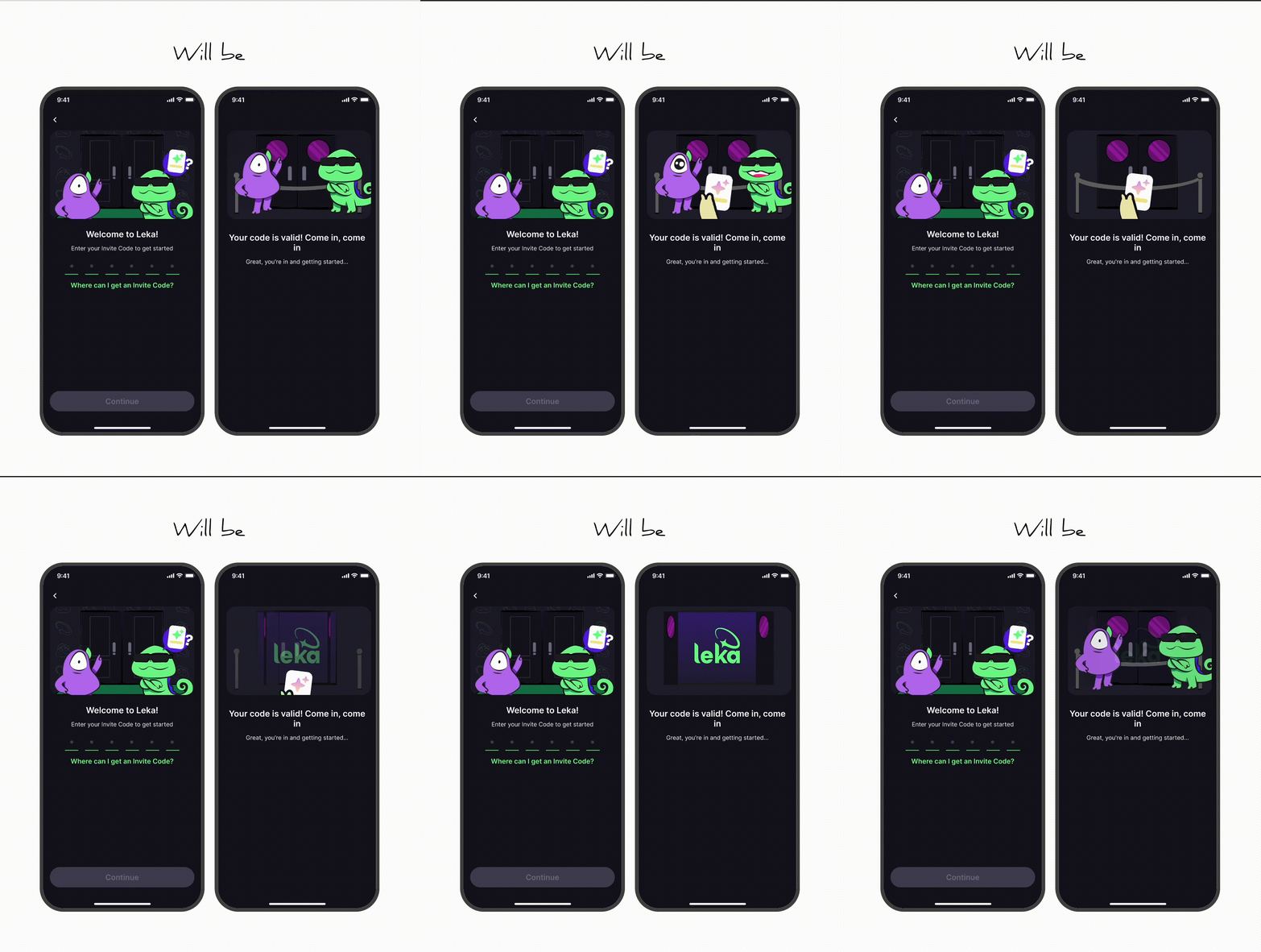
Design Decision 1 — A More Playful Invite Flow
The original invite flow felt heavy and text-based.
I removed unnecessary introduction text and placed the invite input upfront for convenience.
To enhance exclusivity and emotion, I introduced an animated Bouncer character guarding a door. When users enter the correct invite code, the Bouncer opens the door — symbolically inviting them into the Leka world.
This small narrative shift improved both clarity and delight.
Design Decision 2 — A Friendlier Welcome Message
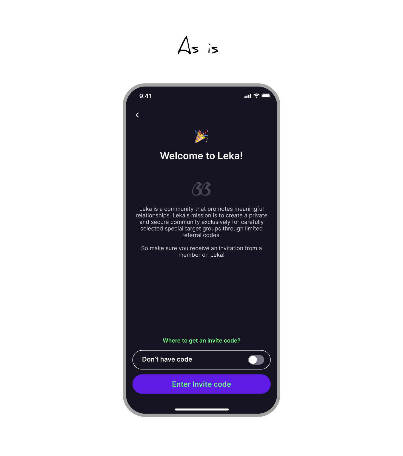
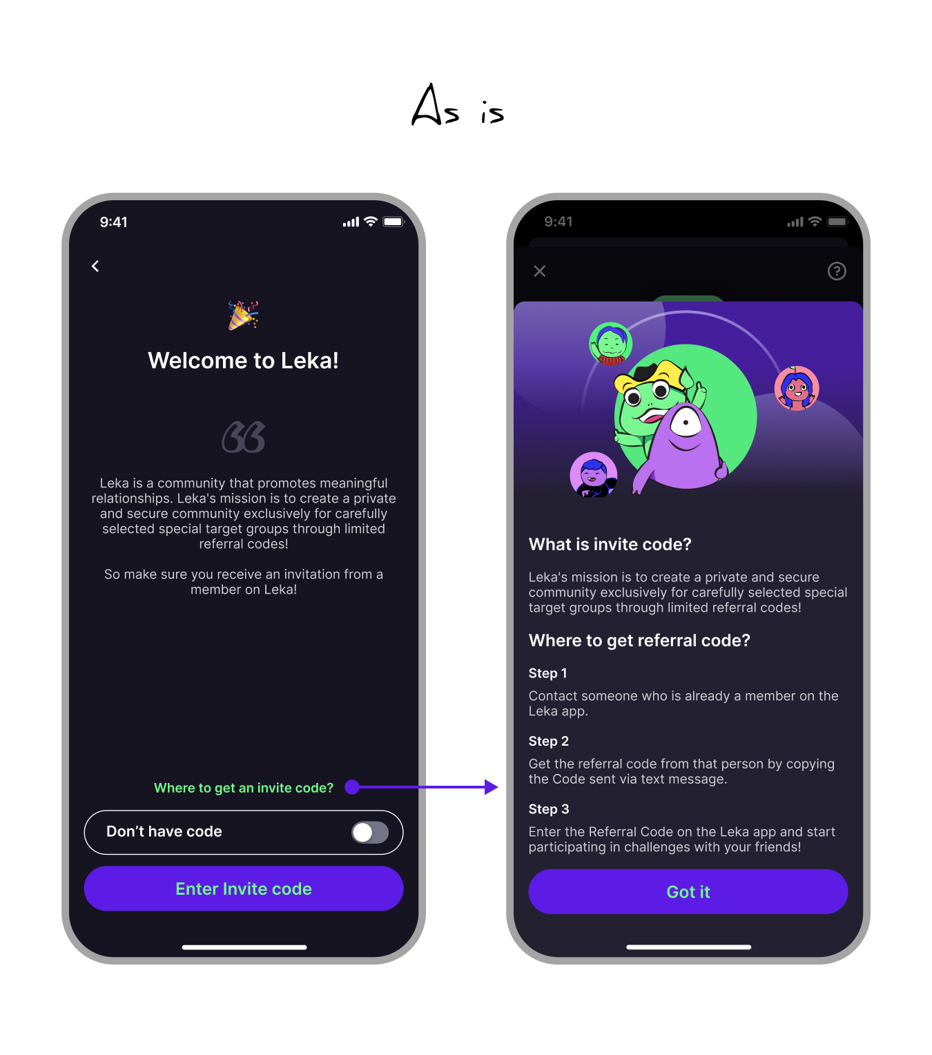
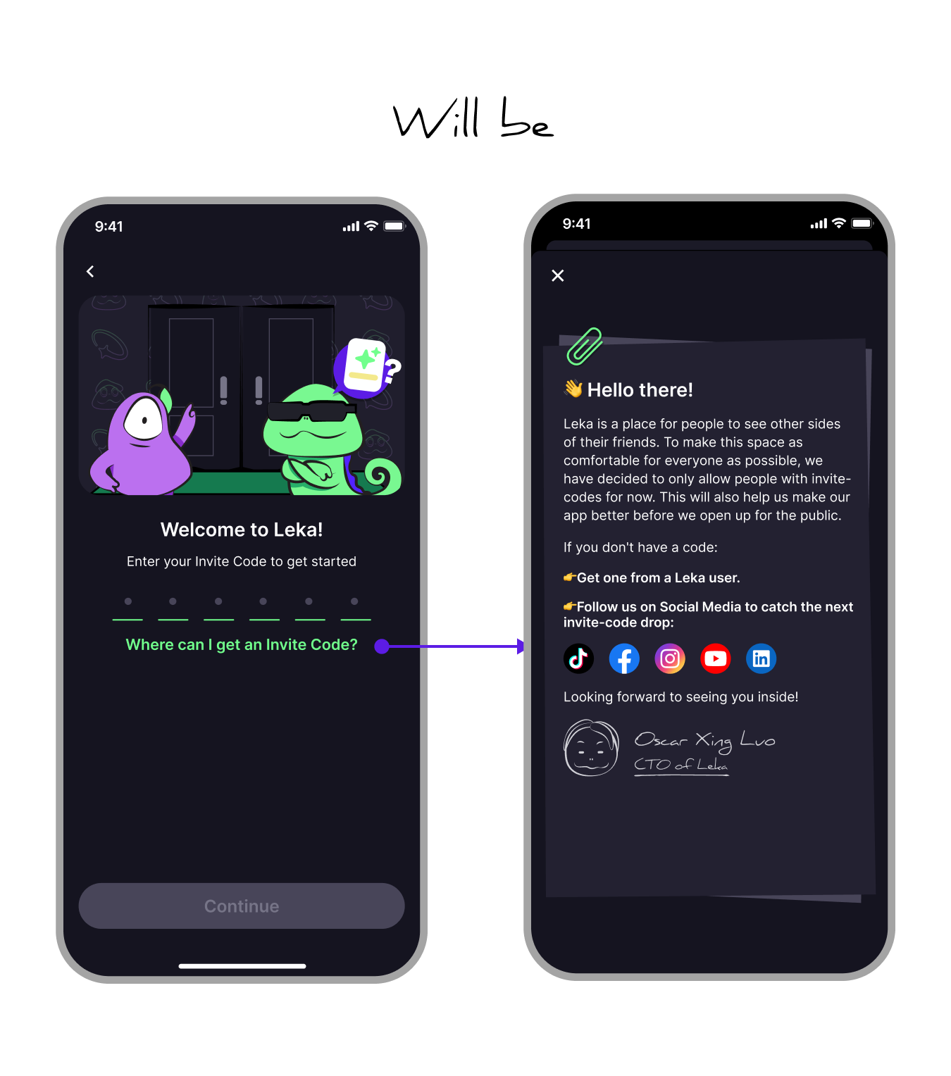
In the old flow, the welcome screen relied on instructional copy. When users tapped “How to get the code,” they were met with even more explanation about how to receive an invite code.
But the invite code was never meant to feel like a technical step. It was designed to create desire, exclusivity, and intentional community growth — encouraging users to invite friends they genuinely wanted inside Leka.
Instead of adding more instructions, I redesigned the moment as a welcome note written by the CTO. The message felt more personal, respectful, and human, while still explaining the invite-code logic in a much shorter and clearer way.
This turned the invite code from a confusing access barrier into a more intentional onboarding moment.
Design Decision 3 — A Mascot-Led Tutorial
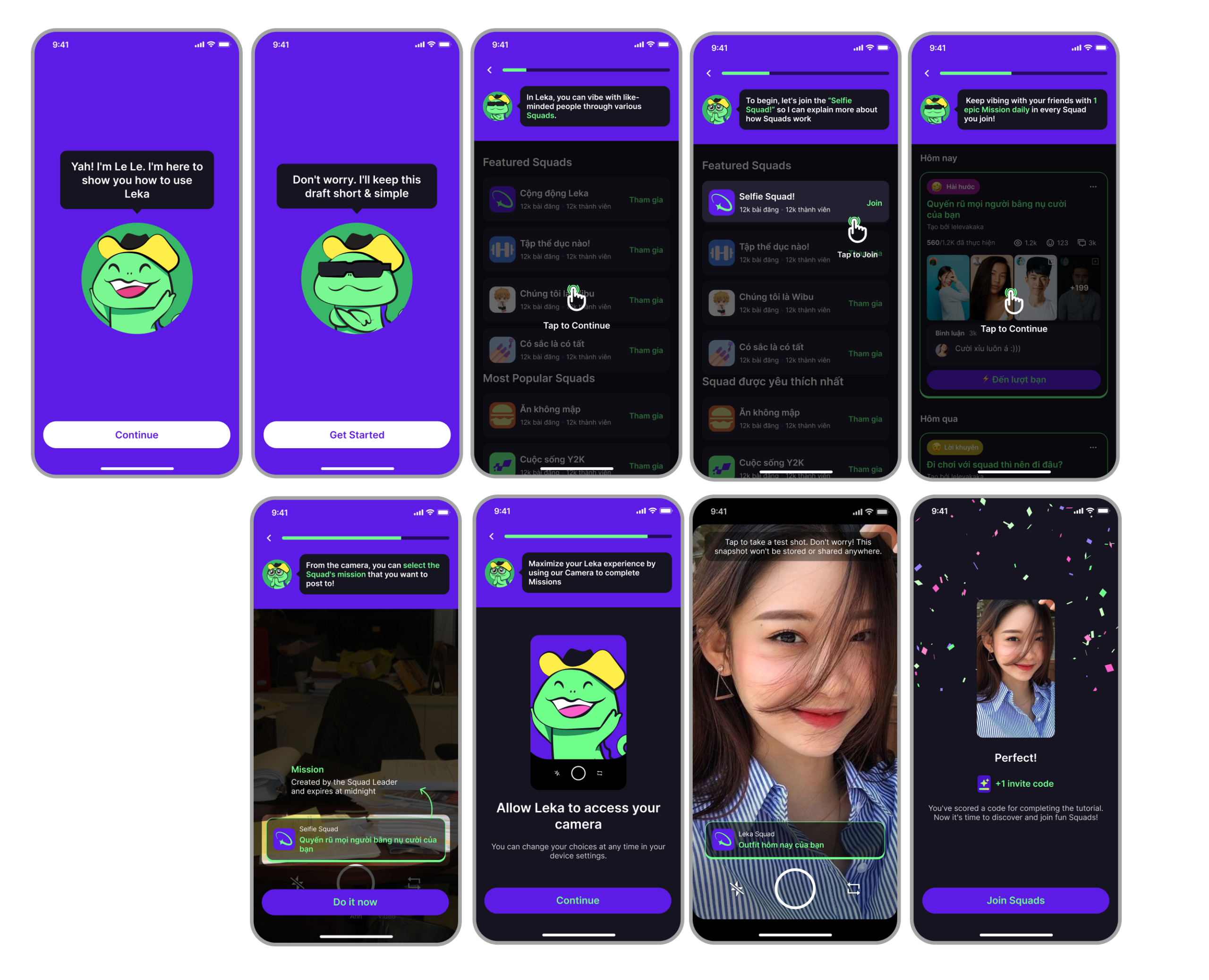
One core misunderstanding centered around Squad and Mission.
To solve this, I introduced a guided tutorial led by Leka’s mascot — a friendly character who explains concepts through micro-interactions.
Although it creates a slightly longer onboarding, this flow was essential for helping new users understand the product’s core mechanics.
Design Decision 4 — A Clear Transition Into the Squad
After the tutorial, users receive a celebratory screen and are immediately directed to join their Squad.
They are introduced to two categories of Squads:
1. Squads created by their inviter
2. Public community Squads
This ensures users are never confused when they land in the main app for the first time.
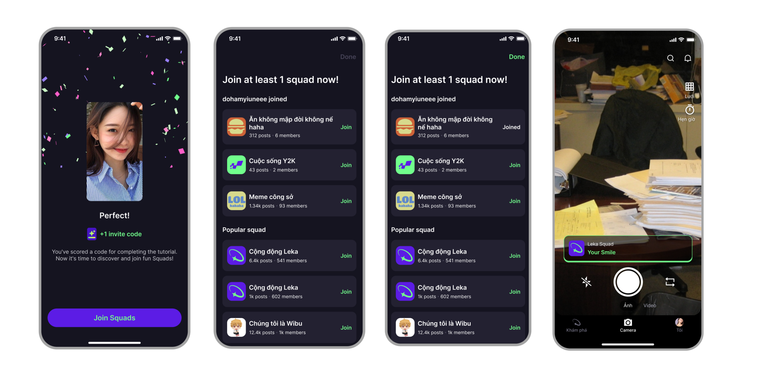
Full Prototype
OUTCOME
The redesigned onboarding resulted in significantly higher engagement and clarity.
73% of active users posted daily, placing Leka on par with Instagram’s early engagement metrics and surpassing Facebook and Snapchat at this stage.
In the MVP phase, Leka reached an exceptional D30 retention of 60% and
an overall daily retention rate of 86%, outperforming most of the world’s top social apps.
The improvements validated our hypothesis:
When users understand the product, exclusivity becomes a powerful engine for organic growth.
+84 903 308 166
CHEUNGJIAWING@GMAIL.COM
TELEGRAM_ @WINGCHEUNG0207
Get In Touch
LET’S BUILD WHAT PEOPLE LOVE TO USE.

DESIGN BY WING CHEUNG
HCMC, VIETNAM